Example use of a component from the component library

Hello and thanks for checking out this example page. Here you can inspect elements and see how a typical section is built in Webflow using our lightweight version of Client-First.
Please start by watching the loom video to the right. Please note, this style guide has updated since that was recorded, but it still covers the major points needed.


Sync the CSS attributes between the Figma and Webflow style guides for all of the values pertaining to containers, typography, spacers, max widths and more.
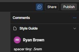
Style GuideTip: Use Webflow Comments as a way to track what the CSS values are of certain class names, such as spacers:
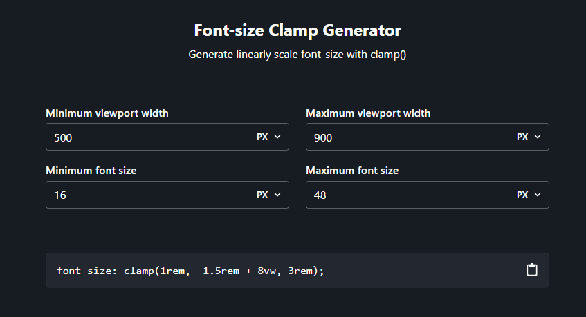
This is how we can add fluid and responsive typography. Click this link to check out the tool. Below is an embed that shows the clamp properties for this style guide.
How to use Clamp Tool:
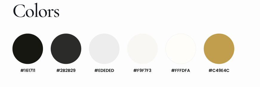
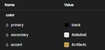
Step 1: Update the colors:
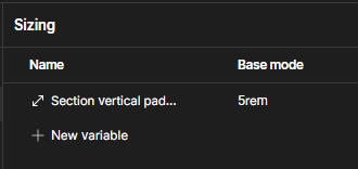
Step 2: Update the spacer size. This one variable controls every Section's padding top and bottom. There are several modes of this variable in respect to mobile viewports as well.

Within this boilerplate project is a folder containing all of the most commonly used sections and components that have been designed by Sher.
For Example, in Figma here are services:
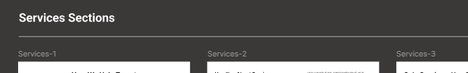
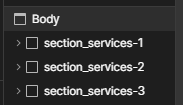
These sections correlate with sections built in the Service Sections Page
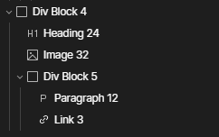
Always structure your HTML in the following hierarchy: Section, Container, Component, etc. No need to use the additional nested padding and margin classes that Client First employs.
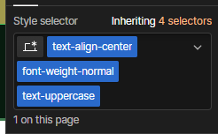
Whenever possible, leverage utility classes available in the Style Guide page to streamline your design process.
Remember: You should typically limit the use of utility class names to a maximum of three per element. If an element requires more than three, it's advisable to create a single custom class name instead.
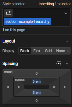
Sections are responsible for providing vertical spacing between elements, ensuring a clean and organized layout. They should avoid incorporating horizontal padding.
Example name: section_name-of-section

Containers should have a max width of a certain px size, with left and right margin's set to 'auto'
Example names: container_small, container_medium, container_large
When taking interactive components, always be sure to utilize the Interactions or custom code that comes with it.
The snippets are typically within the container itself for easy copy and paste utilization. If no code is found, check the current page's <head> and <body> for code associated to respective component
All sliders built in these template pages are built with Swiper.js. The code for each swiper can be found in the <head> and <body> of the page it is hosted on.
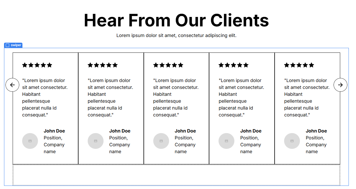
Go to the parent class .swiper and check the ID associated to it.
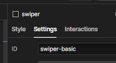
You'll find the code associated with that ID in the <body>

For components that have more advanced functionality, Webflow comments have been added to flag potential hurdles or tips on implementing them.

If looking for more information on a component be sure to open the comments panel to see if comments exist
Important Note: Unforutnately comments do not carry over onto a duplicated project. So you can only look at comments within the MASTER project.